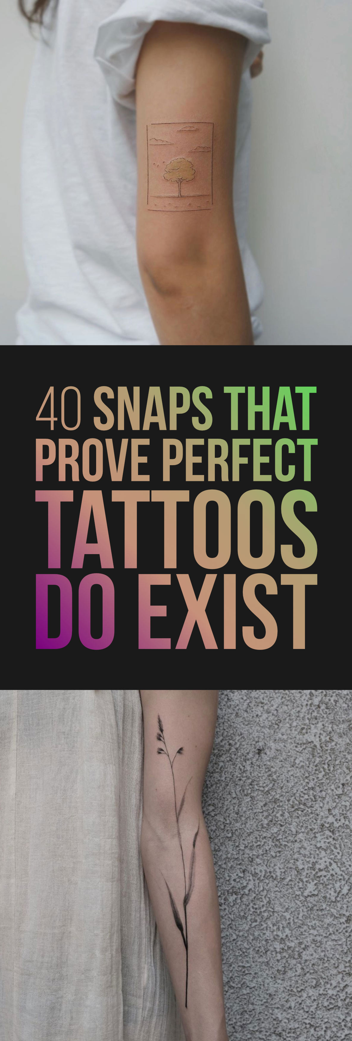
There are a lot of crap tattoos floating around out there. You could even go as far as saying that 90 percent of all tattoos would qualify as amateur in nature. But at the same time, perfect tattoo designs are everywhere these days. The skill, vision, and technique possessed by today’s top artists provide us with a constant flow of extraordinary ink that manages to adequately satisfy our ever-shortening attention spans—you just need to know where to look. At the risk of sounding like a brachiosaurus, that’s the beauty of the internet.
Today I’m going to dazzle you with 40 flawless ink creations that represent the best the world has to offer. And as always, don’t forget to breathe.
This arrow.
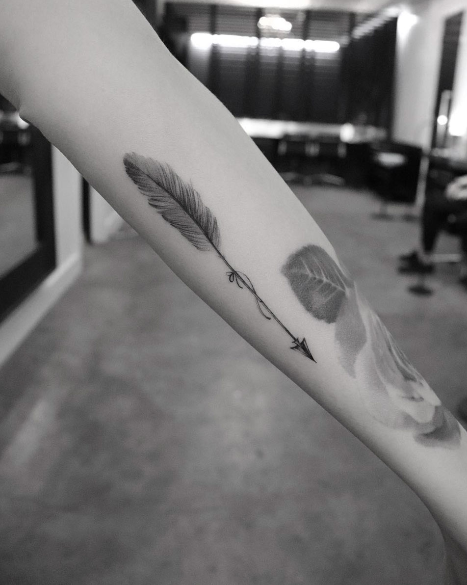
Arrows have always held a special place in my heart. They’re one of the only symbols that looks good and needs no explanation. You really can’t go wrong with an arrow, especially when it’s executed with such elegance and precision as the design above.
This mandala design.
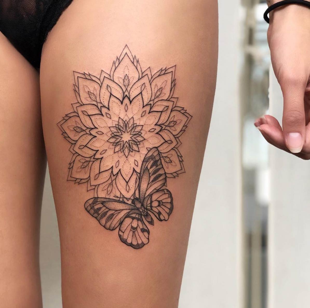
Ira Shmarinova puts a unique twist on the whole concept of mandala tattoo art. Ira’s designs always encompass a high level of depth and dimension that can be attributed to the incorporation of dotwork elements as well as the use of lines of varying thicknesses. This mandala flower is placed on one of the body’s largest canvas areas which is, in my opinion, perfectly suited for large mandala flowers.
This blade of grass.
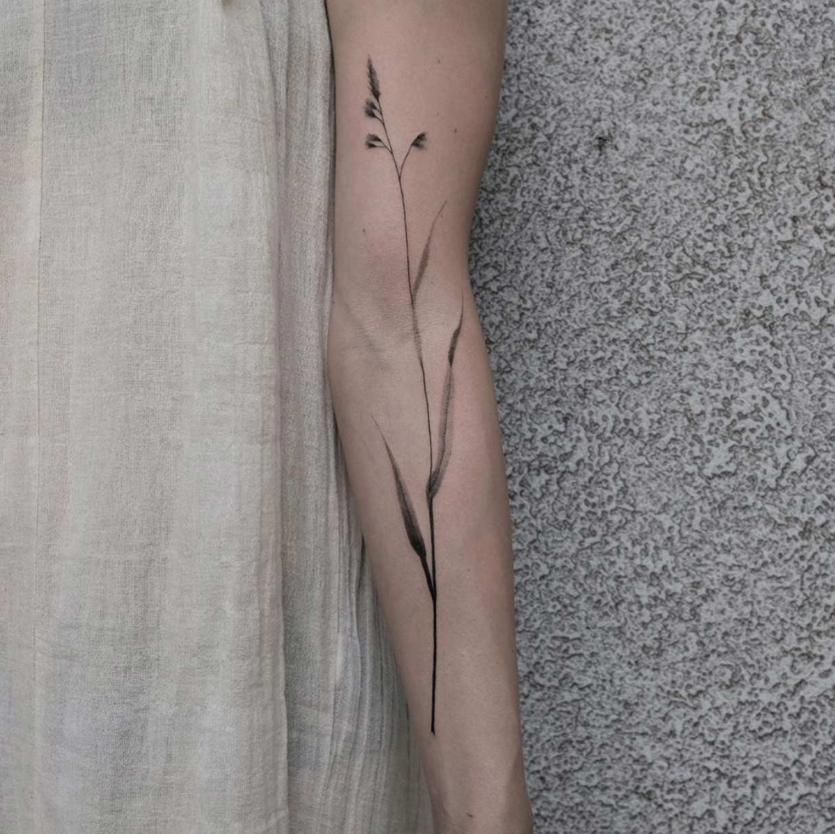
Conforming to the lines of the veins and arm, this vertically placed variety of grass is something that you don’t see everyday. It’s designs like these that make my job so fascinating. New and creative works of art are what I live for. Axel Eismont has been experimenting with a lot of these type of designs lately so if you like what you see here, I recommend checking out his Instagram at the conclusion of this article.
This wisp of smoke.
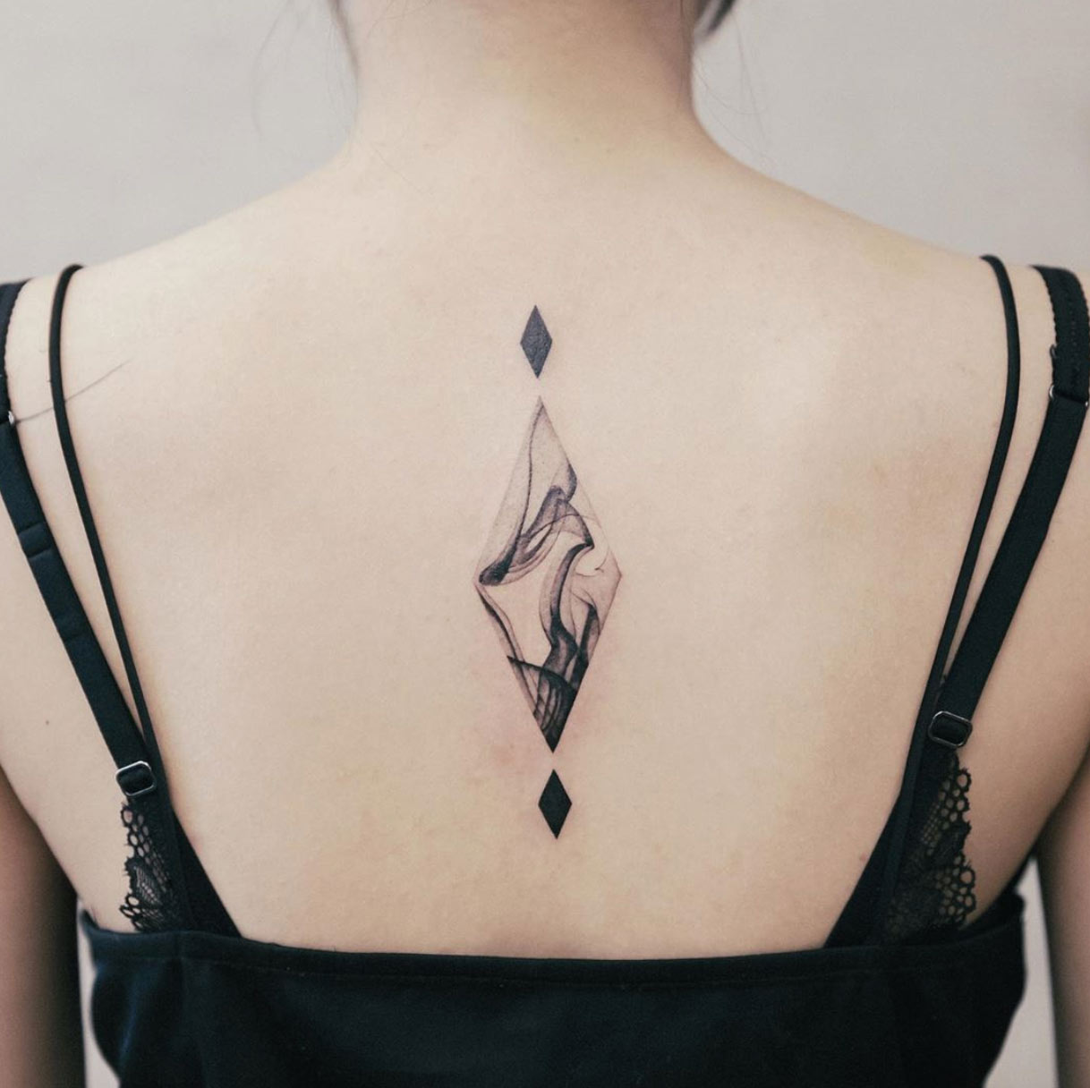
The problem with sampling many types of patterns and elements is that their arbitrary nature and dimensions lack structure which in turn can give a sloppy appearance. Confining these samples to structured boundaries, like this diamond shape shown above, is the perfect workaround. It’s never easy to illustrate smoke, but I think it’s safe to say that Chenjie more than pulled it off.
This gradient strip.
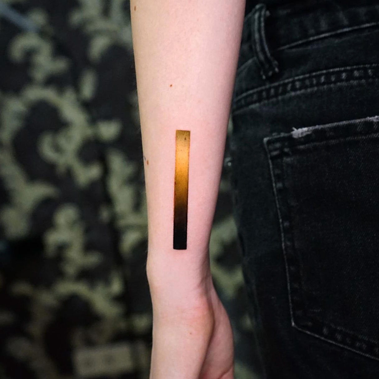
Over the years we’ve featured many gradient designs similar to the one above. But none of the designs even come close to capturing the level of texture that the artist was able to achieve with this particular example. You can almost feel the patina just looking at this design.
These flowers.
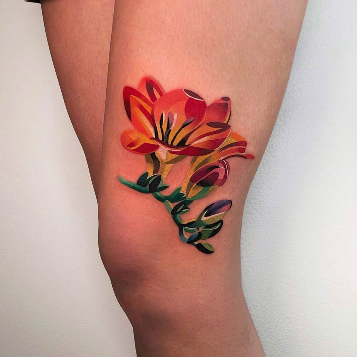
Natsi has a style so unique that it’s almost impossible to describe to someone who has never seen it before. Heavy, broad strokes of color are what Natsi uses to create her works, which always contain brilliant color and a unique playfulness that remind you a lot of children’s animations.
This moon.
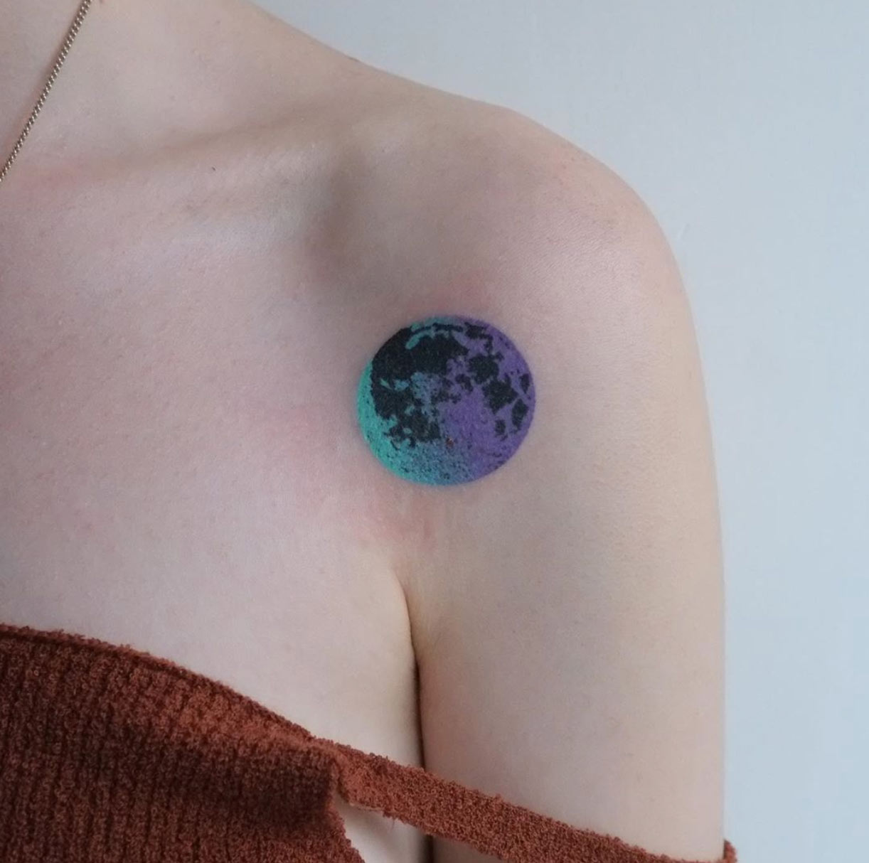
As I’ve said many times before, the right color gradient can instantly elevate the status of any design no matter how poorly illustrated it may be. Of course this design is anything but poorly illustrated. I was just trying to make a point. Yar Put uses color gradients as well as any artist in the business.
This mandala flower.
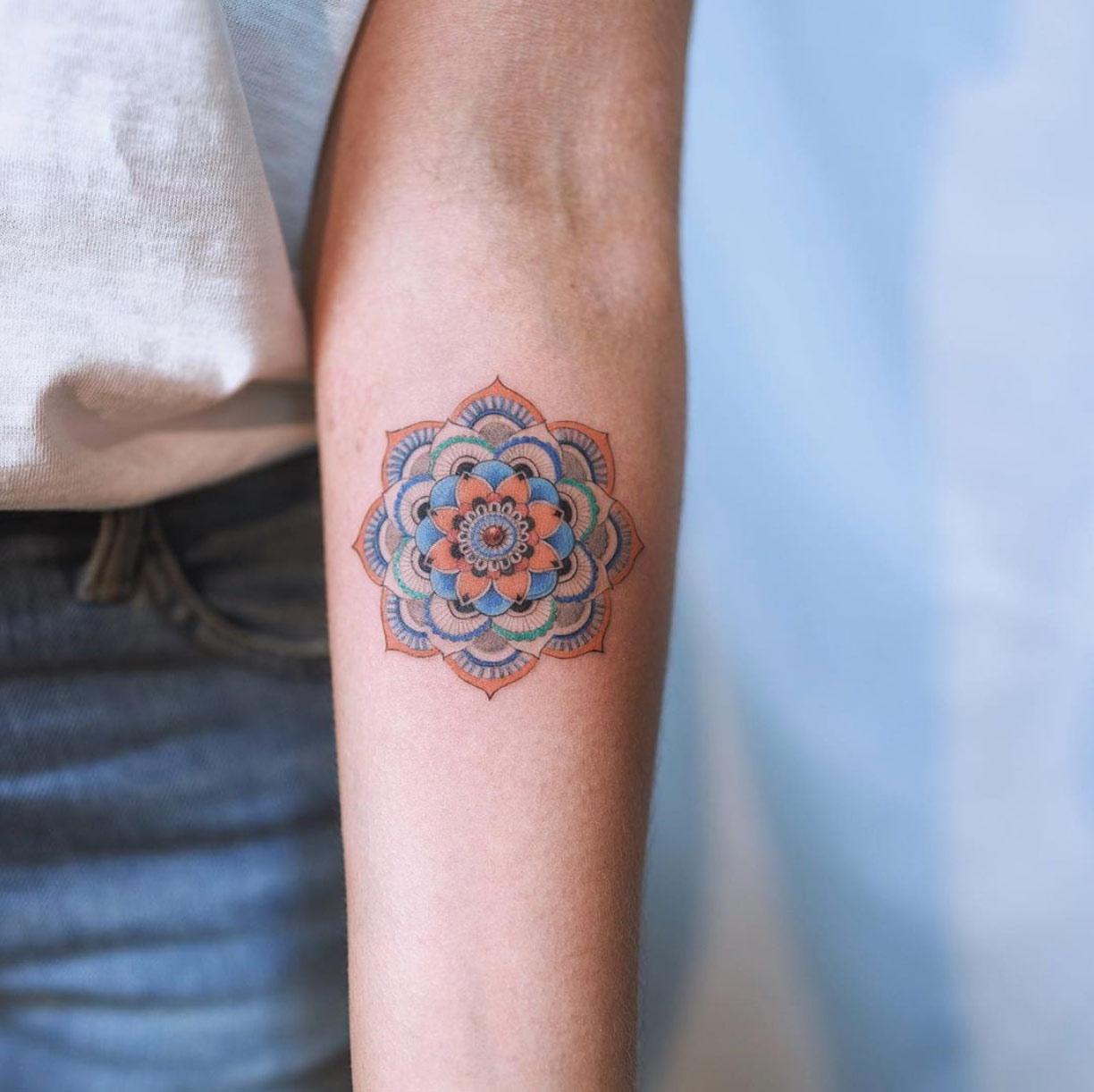
You don’t see mandala flowers like the one above too often anymore. Four years ago, these types of original mandala flowers were all the rage. It’s funny how a design as classic as the mandala flower has evolved so much over such a short period of time. I was referring to the shape and general style of the design. But come to think about it, colorful mandala designs have almost all but been replaced by their more monochromatic counterparts.
This heart.
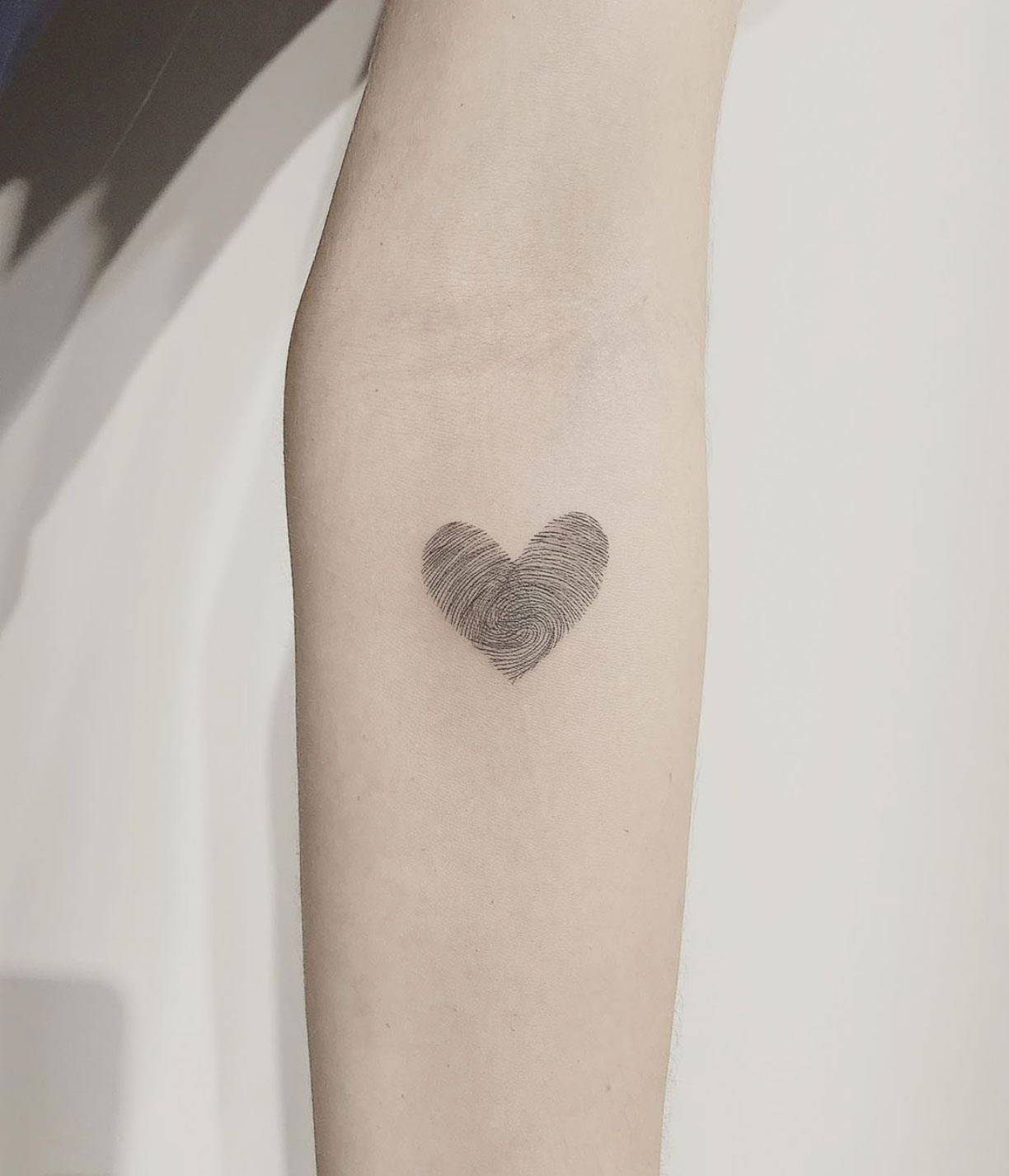
There’s nothing more “couple” than getting a tattoo of two fingerprints intertwined together to form the shape of a heart. Of course you need to somehow get the artist to create authentic copies of your fingerprints to make things official.
Alice in Wonderland.
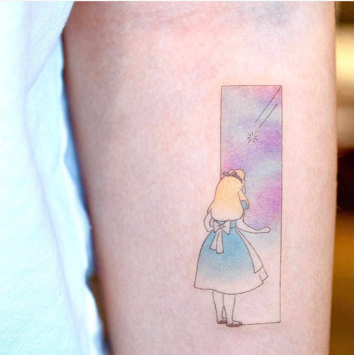
The first article we ever published was a tribute to Alice in Wonderland. The site has come a long way since then, and seeing how much the overall quality of tattoos has evolved since then is quite interesting. There’s about as much magic in the design above as there is in the original movie itself.

